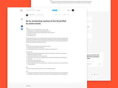
Article
Hi there!
Here are some screenshots of a Website I've been working on recently. For the first time I encountered such a text heavy website which was challenging for me. By doing research and bouncing ideas with other colleagues I came up with the final layout. The tip page presents similarities with existing blogging and article writing websites because the end user won't be tech savvy and we wanted or them to feel comfortable with the layout on a first impression.
If you enjoyed what you just please leave a like, otherwise tell me how can I improve my work!
Thanks :)
More by Paolo Sabatella View profile
Like


