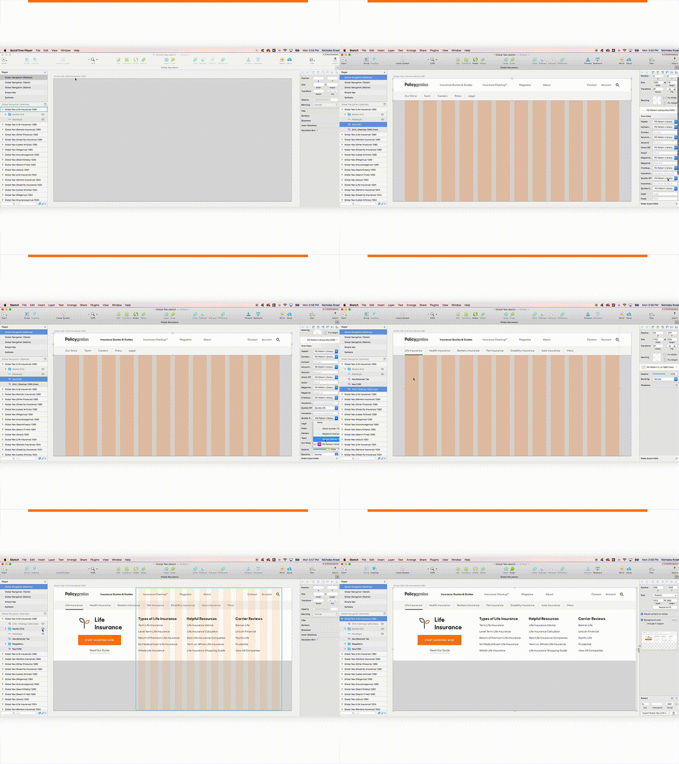
Fully Responsive Grid and Global Nav
As a part of our new branding, I took an audit of our grid system to ensure our new design language had clear and replicable rules across all the layouts the website contains, and to make sure all designers are working at consistent sizes.
- The Fluid Grid resizes to allow for nested grids, while preserving gutters, and is available to every designer from our symbol library - The Nav in our new branding is fully controlled by symbol options, so you can turn on and off different 'selected' states and submenus - The Nav is stored in a referenced sketch library, and any changes deploy to every instance this global nav is used, so changes are easy, and everyone is using the same iteration. - The Nav resizes to artboard width to accurately mimic responsiveness within each breakpoint.
Never again do we have to ask "am I using the latest header/footer?"
See the full post at https://medium.com/policygenius-stories/youll-never-guess-what-they-said-after-i-discovered-this-one-thing-about-responsive-grids-f58cdb0ad7cf
