Marketing Website Design Animation
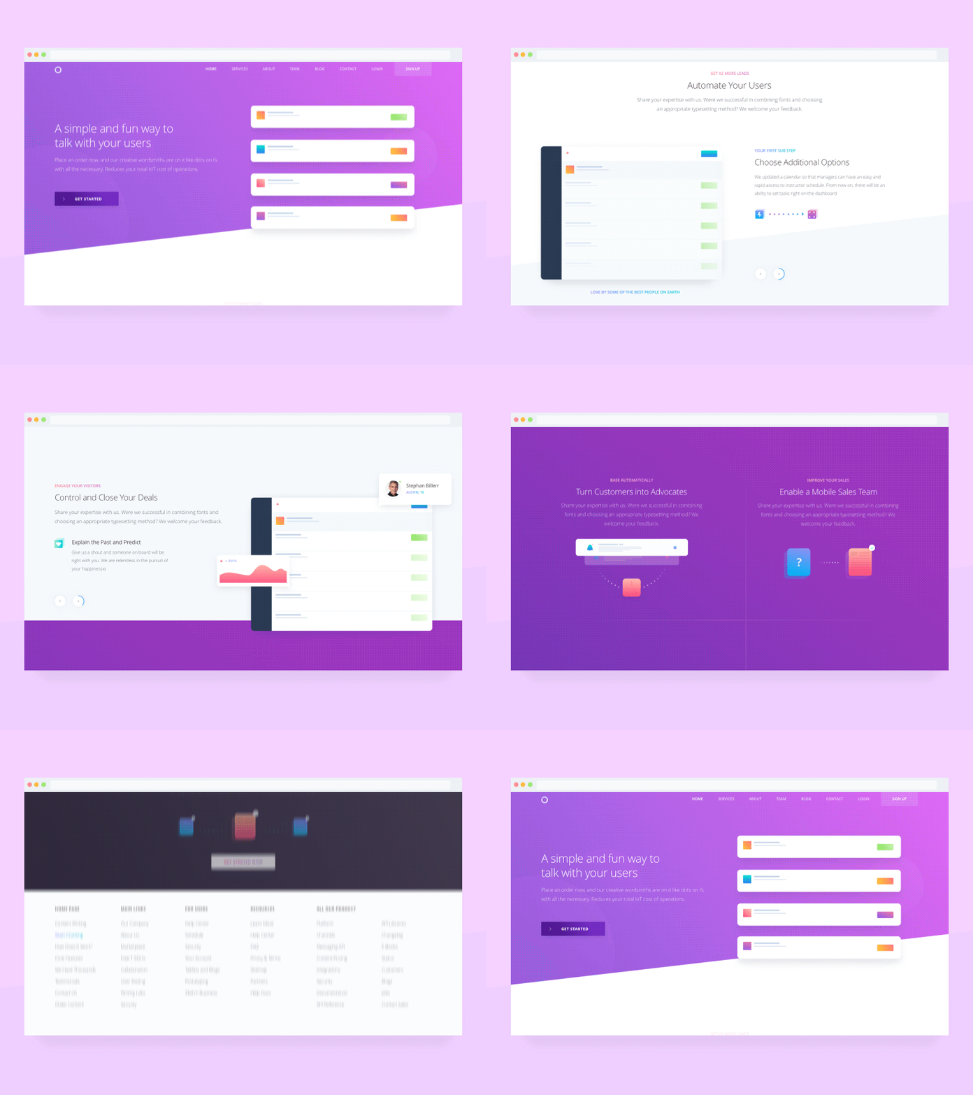
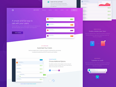
Recently we posted the homepage animation, and what you see above is another page of the same website we’ve been working on here, at Zajno, for a client of ours that shall remain nameless. The business provides a full stack of digital marketing services that match the needs of small and medium-sized businesses alike.
Goals: animating the page to show how interaction design can benefit the overall user experience, adding more life to it and just making it look pretty cool.
Approach: we used subtle animations to add smoothness to the elements transitioning. We added some animated illustrations to liven up the page scroll, so that it looks more dynamic and vibrant.
Results: we ended up with a lively and smooth animation of the page. As simple as that. We would love to know what you, guys, think of that!
Press “L” to show some love!
Don’t forget to follow Zajno on social media and feel free to drop us a line:
Website | TheGrid | Twitter | Instagram | Medium

