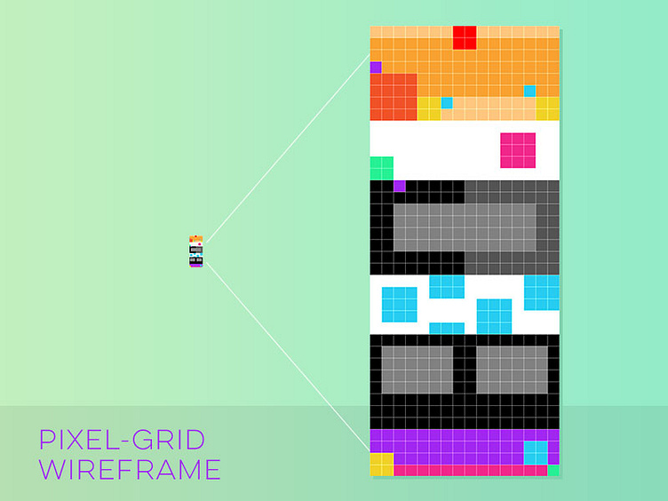
Pixel Grid Wireframe
When planning a blocky website wireframe, utilizing the actual pixel size as your column grid saves time versus building at actual size. It also kept me from getting lost in the details. Extra bonus: rectangle shapes snap to each pixel when zoomed all the way in. What might have taken me 30 minutes or more to lay out in photoshop, took only a couple minutes.
Have you tried this? Got another suggestion? Comment!
More by Brian Behm View profile
Like
