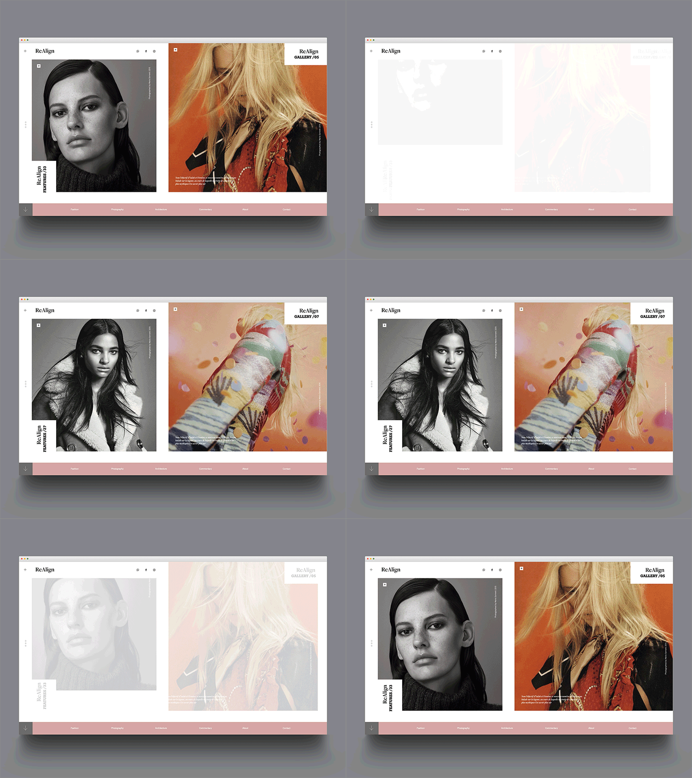
ReAlign
This is an easy shot from a photographer's PF site I worked with last year - the brief was to design something very visual, with minimal text, so that they users eyes are drawn immediately to the photographer's work. The photographer also wished to utilise a particular colourway. I love to work with typography, so this was a challenge for me, despite it's simplicity.
Anyway, less talk from me, thanks for checking it out, have a great weekend!
More by Studio VØR View profile
Like
