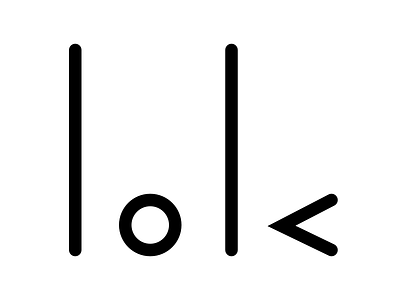
b k
I wanted to make a simple, clean logo, but I always felt like the letter b just looks so lumpy and the letter k looks so harsh. I couldn't think of anything so I just rotated bk 90 degrees and I started seeing shapes instead of letters: two lines, a circle and a triangle without a side. Sometimes, a change in perspective is all you need! :)
More by Barun Kwak View profile
Like
