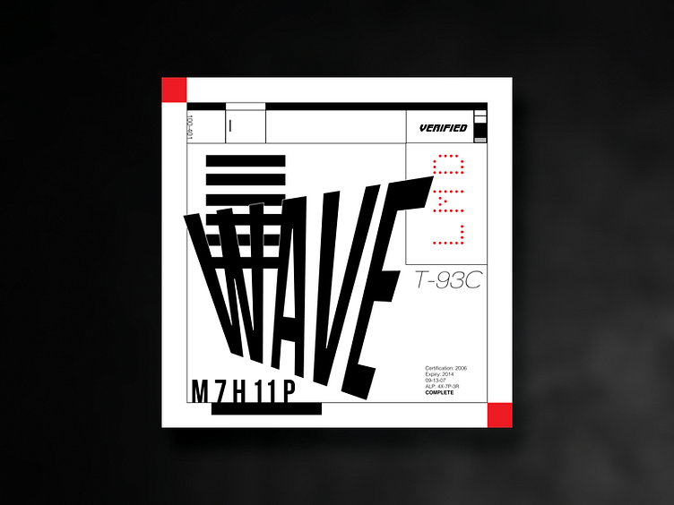
LMD WAVE
Yo.
Wanted to play around with multiple fonts. I was inspired by the packaging label used by a clothing brand that featured a jutting title.
I was trying to recreate the contrasting feeling of being structured vs out of bounds. As well, I stuck mainly to black and white, to stay true to the simple colour schemes of packages.
As well, there's a lot of useless text. The text itself carries no meaning and is meant to represent the incomprehensible text used in packaging, though make no mistake the text in actual packaging carries important info. I myself do not know that sort of info.
This was just for fun and was a way for me to experiment with font pairing and placing. As well, sometimes you have this inner desire to make something when you don't even know what purpose it serves other than "looking cool and interesting". A little happy with how it turned out.
Enjoy :)
