Typographic Analysis
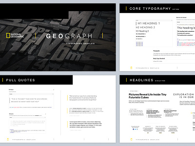
National Geographic recently invested in their own proprietary typeface and I, fortunately, got to review/audit the existing styles used across the dot org family of digital properties. This is a portion of the presentation, including recommendations on how to roll out the new fonts sitewide, that I put together. I was like a kid in a damn candy shop.