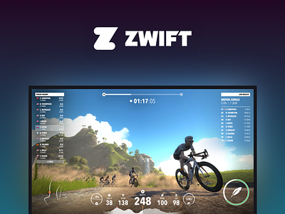
Zwift Cycling App Redesign
Hey, as a regular Zwifter (people say this nowadays) I am slightly bothered by the current UI. This was made in the last few days during my free time. I thought it needed clearer UI and data portrayed without obstructing the beautifully crafted world.
Hope you like it and make sure you check out Zwift on ZWIFT.COM if you just remotely love cycling or running... :)
ps: Also check out full view of the app
More by Ernest Vider View profile
Like

