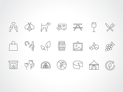
Paso Robles Wine Country: Icon Set
The Paso Robles Wine Country Alliance asked Noise 13 to help reimagine its brand and website.
We started by refreshing the overall look and feel of the brand to reflect the spirit and style of Paso Robles. The logo was simplified and modernized, ensuring better usability at all scales.
We then developed a visual language that’s warm, inviting, and slightly rustic; vibrant colors and contemporary fonts are layered together with authentic photography and a fresh icon set, helping to distinguish Paso Robles from other wine regions.
_____
More by Noise 13 View profile
Like
