Flare iOS Pressed States
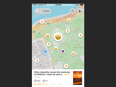
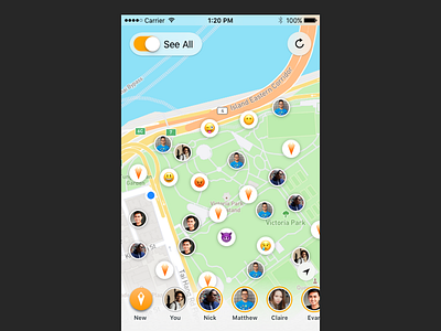
Designed this addictive bubble-wrap-popping type system for giving feedback/guidance on which flares were viewed. In the Flare App philosophy it was most important to show viewers the most recent and closest activity. This system of collapsing ephemiral things they already viewed or that have been on the map for over an hour was designed to focus their time on only the most 'relevant' content being generated.
Color Code: Blue for your flares (auto-collapsed always), Red for public, Orange for your friends. (note: user testing showed blue vs. red/orange was understood but orange vs red was not)
If you like it, don't hesitate to click "L" 💗 or "F".
More by 7 View profile
Like

