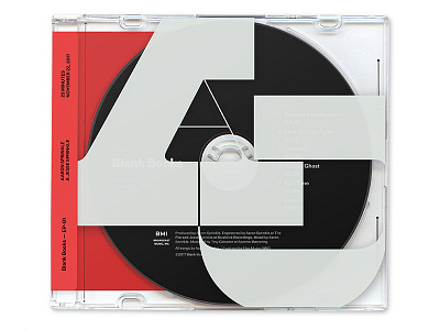
Blank Books EP concept
Aaron Sprinkle is my favorite musical artist, so when he spun up a brand with his brother Jesse I was STOKED. I spent most of the holiday listening to it on a loop and designed different packaging concepts for the album.
Maelstrom is the large yummy type, which I chose because it's so good for large-scale because of its insane thick-to-thin contrast. You can use it large and it still lets air through because the strokes get so slender. Proto Grotesk is used on the CD itself and the vinyl concept, and I found its odd angularity and the AWESOME spur on the "a" were really nice compliments to the curves in Maelstrom. It's got the same svelte lines against blocky slabs. I used Untitled Sans on the wrap sticker, because I wanted that to feel like a neutral, utilitarian addition to the "extra" of the rest of the design—an imposition necessary to share all the information necessary for the album instead of a flashy stylistic detail.
Check out the attachments for all the different ideas and to see the back of the wrap-around sticker, and PLEASE go listen to the EP at http://blankbooksband.com and show the brothers some support!
Typefaces used: Maelstrom, Proto Grotesk, Untitled Sans.


