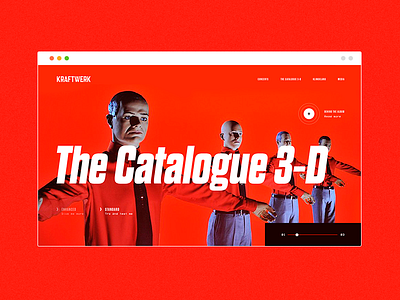
Concept 16 - Kraftwerk / The Catalogue 3-D
Words are almost unnecessary when it comes to Kraftwerk. Their website is an example of brutalism but I wanted to try a different approach with a strong, bold headline and clean ui.
Don't forget to press the L button and comment below if you liked what you saw. I really need to get more exposure here so every bit of help is really appreciated! :D
See you Space Cowboy...
More by Andrea Giunta View profile
Like

