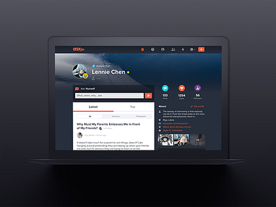
The New ASKfm Web Look - Profile View
Full project here: https://www.behance.net/gallery/59139081/The-New-ASKfm-Web-Look
The new web version is built around your feed - the heartbeat of our product. The updated darker look puts it in the center, at same time keeping other stuff easily accessible but visually secondary. Same logic applies to other ASKfm parts as well - wherever you are, the most important stuff is right in your focus.
More by jundo.design View profile
Like
