Page builder
Portfolio builder.
Core objective
Allow students with limited creative skills to easily build a multi-page, online portfolio from scratch. Portfolios would be used for both personal use and academic assessment for course modules.
Secondary objectives and challenges
Portfolios will incorporate various content blocks from external services that resonate with academic use. Due to the nature of assessed student work, pages will also house large amounts of text but will still need to appear personalised. Crucially, students are driven by the content and will not want to spend time on visual appearances but still expect it to look appealing.
User stories - considering the student
User research allowed me to discover a whole range of interesting user stories. Without listing them in a drab format below, I’ll instead break down the findings that I feel differentiate the student portfolio builder from a traditional website builder:
Students will need to link other course ’assets’ built (blogs, templates, reflections) to their portfolio.
Extensive amounts of text will be used to satisfy required course word counts.
Portoflios will be navigated in a different manner to an average website. Users (tutors) will not navigate to a specific page (for eg. A user wanting to buy a fridge from an online electrical platform will naturally know they need to navigate to the ‘white goods’ section) but instead read all content on the portfolio in the manner of a book.
Tutors will set portfolios up that include template pages along with a set structure with the desire to distribute to a set of a students.
A conversation platform between the tutor and student will be required in order to feedback continual improvements to the portfolio
Portfolios will often be collaborative
First phase - adding content blocks
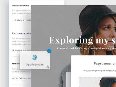
It was essential that I appreciated that students will often build portfolios in isolation and lack necessary creative skills. Student focus will be on course content but will expect the product to easily help them produce a decent visual output. The core feature of the portfolio will revolve around intuitively adding content blocks to the page in a drag and drop manner.
Design assumptions
I assumed the success of the portfolio builder would relate directly to the ease of dropping blocks, populating with content and effectively build a page quickly. The student would immediately feel confidence from the apparent quick progress in building a substantial page. Our research showed that pages would be pretty simple in their nature - usually including a personalised hero banner with the remainder of the page being copy heavy.
Copy heavy considerations
The nature of student assessment requires plenty of copy. Portfolios that were being used for academic assessment (an example would be an Occupational Therapy student being asked to complete a page of their portfolio for every site visit - which will then be assessed) typically remain copy heavy. For this reason I made various design considerations:
800px reading width. Text blocks were set to a default 800px width to maximise the reading experience. Line height was also adjusted to dealt with reading large amounts of copy.
In-line formatting allows students to add subtle personalisation to their portfolios. The formatting toolbar had to have a good user experience as it was used so often to add academic links etc.
Blocks can be dropped next to each other and resized appropriately. Subtle layout customisation such as this allows the user to believe they’re creating unique page layouts in what can be considered a dry medium (plenty of academic copy, little imagery).
What can a student achieve with a final output?
Portfolios are flexible, really easy to build for a novice user and also allow sharing and assessment functionality.


