iOS Calculator Redesign
Hi Guys, I have been working on this redesign and have conducted user research on the same. Please find them below.
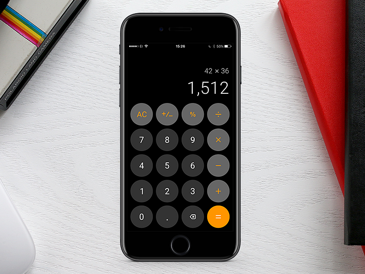
Short Summary of User Research 1) Users were not able to understand hidden swipe delete functionality. Most of them came across delete functionality accidentally. As swipe delete functionality is hidden in iOS, it is very difficult for the user to understand. "Recognition rather than recall" is one of the very important usability heuristics of UI design. Considering this principle I added back/delete button up front to overcome this pain point. 2) While doing large calculations in iOS calculator users were not able to recognize previously typed data, all they could see were the results. I believe that the same principle "Recognition rather than recall" was really helpful to solve this pain point therefore, I am showing previously typed numbers and functions also making sure that the attention still remains on the result.
I would love to know your views on this design. Press " L" If you liked it :)
