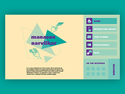
Landing Page for personal website
#DailyUI #003
I've always wanted to implement the golden ratio in website design, even though it can cause it to look visually heavier on one side. I think it still works in this case, as the main content to be displayed will have the prominence it deserves. I'm still exploring different contrast options to mitigate the proportions.
Don't miss the icons! Although this isn't my first time creating them, I really enjoyed this batch.
As always, feedback and comments welcome!
More by Manasee Narvilkar View profile
Like
