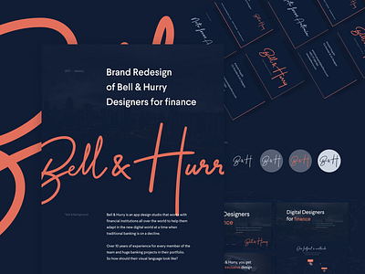
Bell & Hurry Case study
So finally, little Behance case study about @Bell & Hurry rebranding that we were working on last few months.
It answers our very first question - Over 10 years of experience for every member of the team and huge banking projects in their portfolio. So how should their visual language look like?
Thank you and have a lovely Monday!
Lucie
More by Lucie Bajgart View profile
Like

