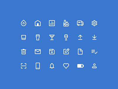
Nectar UI Icons
When I joined Nectar a couple months ago, they were using a mishmash of icons from a variety of sources. So one of my first tasks became creating a singular, consistent set that could satisfy the needs of the internal tools and consumer facing products across the web, Android, and iOS.
The goal was to create a modern, yet approachable set, which resulted in the line-icon style with soft, round edges. To maintain consistency, the entire set is based on the Material Design icons and guidelines.
More by Cristian Ruiz View profile
Like
