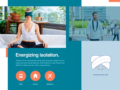
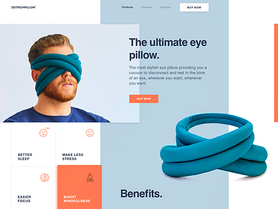
Innovative Eye Pillow Landing Page Design
Hey buddies!
As we promised yesterday , here is another piece of the website design we created here, at Zajno, for our new clients, an awesome company that produces all kinds of pillows, including pretty unusual ones.
Goals We were tasked to design a website dedicated to one of their new, revolutionary products - Eye Pillow. The product is a cool innovation and we really liked its concept as every now and then all of us feel the necessity to be alone for some time either to focus or to calm down, but it’s not always possible. However, an eye pillow makes it possible whenever and wherever you want. Pretty useful, isn’t it? And 100% trendy too. So we jumped at creating a website that would match the product’s originality and speak to the target audience.
Approach Since our goal was to connect the brand with the target audience, we tried to find the most appropriate solutions to do that. To this end, we chose to use demi bold typography together with geometric layout ‘cause, in our opinion, it’s the best match to the concept. As for composition, we kept on experimenting with it too, as we did before. We adopted a more unconventional approach to composition because we got really interested in working with non-trivial solutions. We like challenging ourselves, and this project is one of these challenges.
Results We came up with a lively and unconventional website design that adheres to the product’s style and originality and speaks to the target audience. Moreover, while creating this design we are trying to find our own way instead of following usual patterns. And we believe it’s worth it. What do you think? We’re still working on it and there’s more to come. Keep in touch and stay tuned!
Share your ideas, we love hearing from you!
Press "L" to show some love!
ᗈ Join our Newsletter! ᗈ Website ᗈ TheGrid ᗈ Spotify ᗈ Twitter ᗈ Medium ᗈ Facebook ᗈ Instagram


