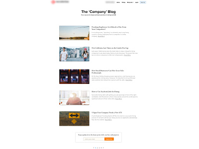
Blog Home Page Update
May be a little hard to see but......!!!!!!!
This is update of our current company blog home page. The purpose was to make the posts more accessible to the user by reducing current pages 'clutter'.
The inclusion of a serif font gives a more 'print magazine' feel and the reduction of the article body content increases focus on the post title rather than the body itself.
Email subscription box has also be moved to the lower part of the screen as before it was distracting away from the posts themselves.
Slight changes to the page numbering system increases the visibility of currently selected page.
More generous spacing all round increases the white space and allows the user to 'see' the individual posts from amongst the crowd!
