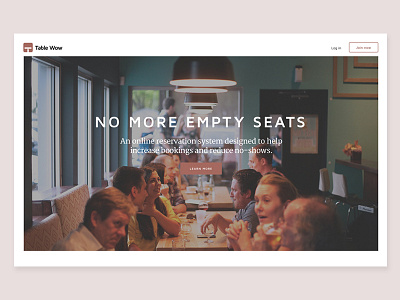
Table Wow home page #2
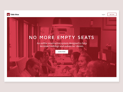
This version of the home page design is all about impact. I wanted to keep the layout used in version one but make the image styling totally different.
1) The bold red instantly captures attention, quickens the heart rate and makes you stop to take notice.
2) It creates a stark contrast, so the headline and intro paragraph are easy to read.
This image style could be useful for a brand awareness campaign.
I'd like to know what you think about this one!
Thanks!