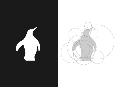
Penguin
Really glad with the result of this beauty!
The client wanted to change their cartoonish penguin logo for a more high-end finish. Their brand was originally filled with different gradients, effects, and it had a toy vibe to it. It wasn't well received by the public as it was misleading because they sell Trailers and refrigerators.
Since the client wanted to stick with a penguin, we opted for a neutral and flat direction. The neutral colors make it functional for both refrigerators and Trailers, being two extremely different products. Basically, we wanted to avoid a frost feeling because of the Trailer department.
More by Sylvain Drolet View profile
Like
