Yoga App: Cart Flow
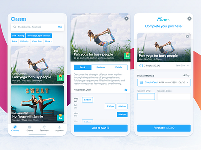
This screen required a bit of thinking. Key concerns:
Search:
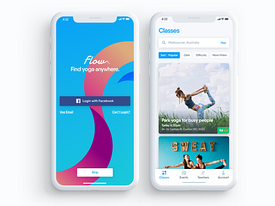
- How do you encourage users to filter potential hundreds of local yoga classes, and keep the user informed of active filters?
- Card text overlays: what crucial bits of information do we need while scrolling? Location, Title, Class Times, Rating?
- How do you make sure card images look good across multiple device widths?
Class:
- How do you display a weekly calendar of classes that a user can quickly select?
- How can we compress the view (ie: remove days where there are no classes) without confusing users?
- What if the user has a specific date in mind?
Checkout:
- Again, what's the minimum level of elements & interaction required to avoid drop-offs?
- How to up-sell users on the checkout screen without forcing it down their throat?

