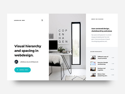
My First Skillshare Class
'Sup guys
After months of working on this project it's finally here.
I never thought I was gonna do this actually but i'm really happy I did. It was a couple of months of dealing with new things like camera equipment, editing and all that stuf. There we're times I thought I was never gonna be able to finish this, but here it is.
I present to you guys my first ever skillshare class. I really hope you guys check it out and really hope you guys like it.
LINK(free month of premium): http://skl.sh/2h4JrWa
The class is all about visual hierarchy and spacing in webdesign and how you can use that to come up with a minimal style of webdesign. Here you can see the breakdown of the lessons.
LESSON
———————
1. Intro (who am i, and what you will learn)
2. Why is visual hierarchy important
3. Different ways of visual contrast
4. How I group elements
5. Exercise: Subject/brief
6. Exercise: Simple wireframe
7. Exercise: Hierarchy & spacing in design
8. Exercise For the student
9. Round up
The class is about 1 hour long and is made for intermediate designers who already have the basics of Photoshop down.
Use this link and get 1 month of Skillshare premium for free! (maybe it's even 2)
LINK: http://skl.sh/2h4JrWa
Sorry for the long discription here but i'm really hyped about the class! :D
Thanks in advance to everyone that's gonna check it out!
Have a great week everyone!
Peace ✌🏻

