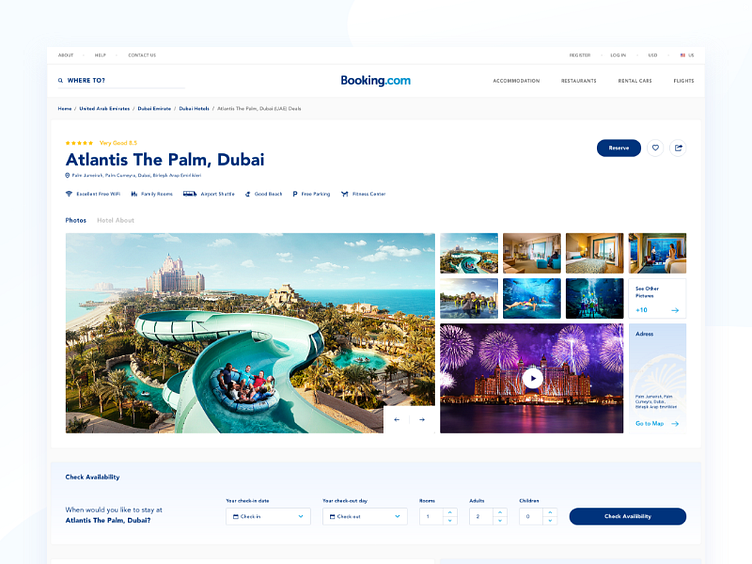
Booking Redesign Website Concept_Hotel Detail Page
Hello to everyone, First of all, I want to explain the idea of this project exit. Last year, Booking.com sent me a job offer to take part in the design team and told me that they wanted to see me among them. Unfortunately, I told them I could not accept the offers because of some special reasons. I started to think about what would happen if Booking.com website was redesigned, and I am proud to share it with you, I hope it will be a useful touch and inspiration.
Solution: For users, the hotel’s detail page is clear, easy to understand, and the hotel pictures have to be shown clearly.
These details are important for the user experience. because the user can easily and neatly access the information he wants to reach, which is very useful for the site. I have designed a page that is more comfortable and free from unnecessary information considering such details.
Presentation Link: https://www.behance.net/gallery/58771463/Booking-Redesign-Website-Concept
