Damn Good Prints Monogram
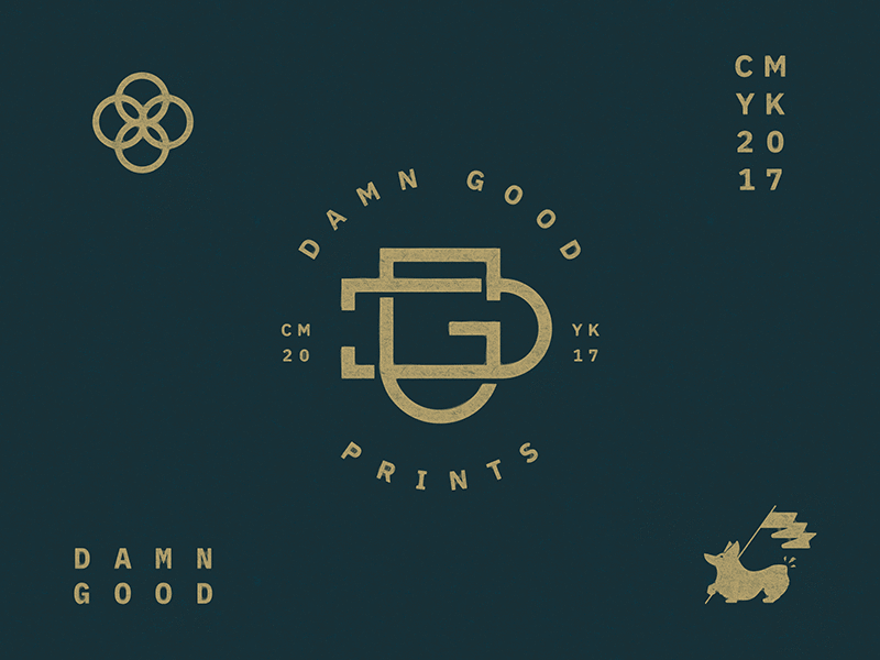
I'm proud to introduce the monogram design for Damn Good Prints, a sub-brand of Damn Good Brand.
It's always been important to me that the Damn Good identity be versatile enough that I can attach secondary intent to the core of the messaging. This is the first visualization of what will eventually spill over into additional categories such as writing, products, and more.
For this first version I decided to use IBM's new Plex type family. I might change some things around a bit, but the monogram mark will likely stay the same. As a whole, IBM's new font is beautiful, and I can see myself using it a lot more of my work as I move forward.
Thanks for looking, liking and commenting!
