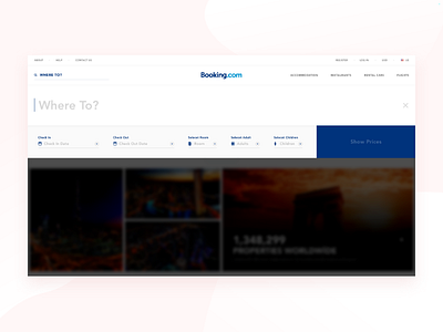
Booking Redesign Website Concept Booking Search Page
Hello to everyone, First of all, I want to explain the idea of this project exit. Last year, Booking.com sent me a job offer to take part in the design team and told me that they wanted to see me among them. Unfortunately, I told them I could not accept the offers because of some special reasons.
I started to think about what would happen if Booking.com website was redesigned, and I am proud to share it with you, I hope it will be a useful touch and inspiration.
Solution: It is necessary to clearly show what they are doing to the user and what they want to do,
and it is always a good idea to focus on just the area where they want to operate. This is why it is more useful for
full screen hotel reservations and more accurate user experience in terms of focus.
Presentation Link: https://www.behance.net/gallery/58771463/Booking-Redesign-Website-Concept
