Astrill VPN - redesign
This week for our DC UI Challenge we wanted to redesign the Astrill VPN widget and mobile app. Our team use Astrill every day and had a bunch of ideas to improve the UX & UI.
Press “L”to like and don’t forget to follow our DC team on Dribbble.
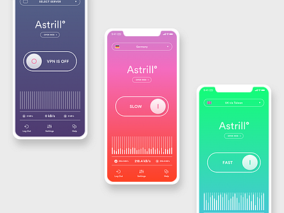
First, I got rid of all the extra elements on the main screen leaving only the functions to which you need to have quick access.
One of the main tasks for me was the way to give the user a quick and easy understanding of the current speed of the VPN connection. For this, I use a color indicator on the entire surface of the background. The color system is intuitive and clear to everyone: green color indicates a good connection, red is about bad. Thus, the user needs merely to look at the screen to see if it is necessary to change the server.