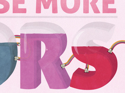
Use More Color
This poster is part of my poster series I was working on. Clients VS Designer is about the usual things clients want designers to do but it does not make sense from a design point of view.
Sometimes clients want an already colorful website to be even more colorful to shoot rainbows out of its ass, or I do not know. Or! Sometimes they want websites that should not be very colorful to be the same example I mentioned above with the rainbows and buttoxes.
You can check out the full Low-Res version here: http://bit.ly/wAbDW8
More by Viktor Fejes View profile
Like

