M & A
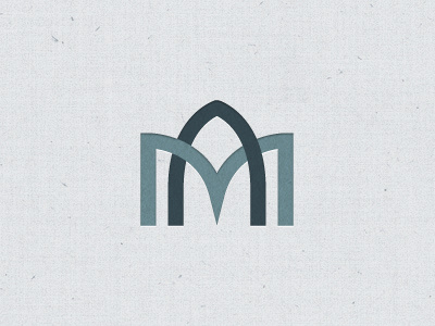
Working on some concepts for a logo that is church related using the letters M & A. I sort of liked how the A looked like a gothic arch and maybe even stained glass. Do you feel any of that when looking at this or is that a stretch?
More by David Pohlmeier View profile
Like
