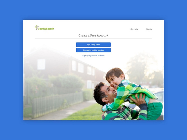
FamilySearch Registration
We discovered a problem in the current registration flow for FamilySearch where there were users that weren't verifying their email or phone number. Missing this step in the registration process, was prohibiting them from using FamilySearch with their account. We noticed that this was impacting the FamilySearch apps the most, because there is no logged out experience in the app.
Through user testing we learned that often times people were completely missing the last screen that was telling them to go check their email or their phone to verify.
This was a proposed design solution, where I moved the verification step to the front of the process instead of the very last thing. I also made changes to the verification screen that would help make it look less like a pop up notification and instead be an obvious next step in the registration process.
