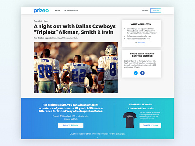
Prizeo Campaign Page Redesign
I'm working on a redesign of our campaign pages at Prizeo and trying to figure out a way to create a bit more of a landing page feel at the top of the page to increase conversion.
~90% of users land directly on campaign pages via social media or email as opposed to finding our campaigns organically from the home page. Capturing attention and allowing for easier conversion is a priority.
I'm starting to like the idea of "featuring" our lowest-barrier-to-entry donation, $10, and also featuring a higher reward level to introduce our users to the platform. They then would be able to explore reward levels below, similar to a Kickstarter or Indiegogo, and view a more detailed explanation about the campaign and the cause.
More by Kevin Cullen View profile
Like
