Astrill VPN - Redesign
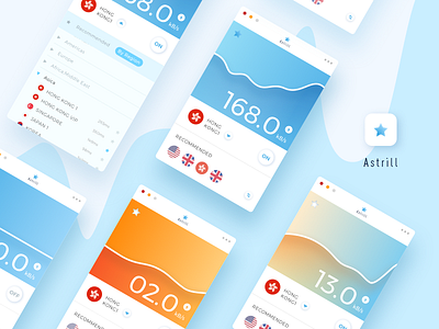
This week for our DC UI Challenge we wanted to redesign the Astrill VPN widget and mobile app. Our team use Astrill every day and had a bunch of ideas to improve the UX & UI.
1. Clearer functional button.
Emphasis on most important functional buttons like ‘on/off’ and ‘switch server’, etc. Hiding other least working buttons, making the interface clean and easily used, reducing users’ learning burden compared to old version.
2. Visualized the speed data flowing
Using contrasting but soft colors to indicate the speed changing and also could stand out from your desktop.
3. The quick way to connect to the fastest server.
Recommend users the fastest server automatically. Grouping server in a region, so that you could find the one wherever you change your location more quickly.
Press “L”to like and don’t forget to follow our DC team on Dribbble.
