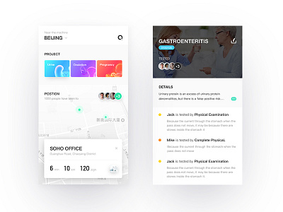
urine test project 2.0
Based on the old prototype has been redesigned. among them. This element of this visitor has been added to try to improve the interaction between the user and the machine. At the same time, the layout of the page, the use of font contrast and other techniques, trying to make the page more breathe. In the icons / pictures / avatars with a uniform "round" treatment, the circular looks very full, and a fusion feeling, in line with the product "affinity" positioning.
More by stay View profile
Like

