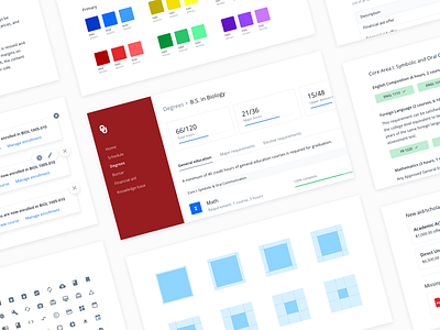
Crimson and Cream (and a little whitespace)
Still a WIP, but we're getting closer to having a consistent and unified design system...all while using an extremely difficult brand color (crimson). Shout out to @MaxSteitle for keeping us minimal.
More by Ryan Hulseberg View profile
Like

