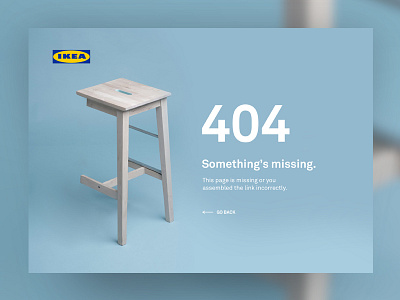
404 Page — UI Weekly Challenges-Season 02 / W [2/10] V2
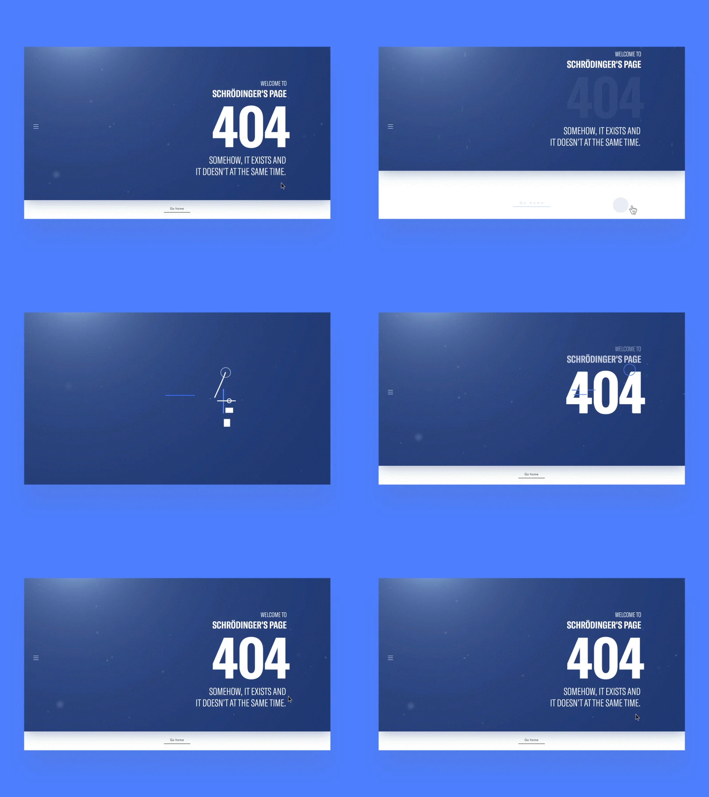
And for a second one, I wanted to play with typography forming animation and figured out 404 is a pretty good looking text for something like that.
So here it is :)
More by Ivan Radovic View profile
Like

