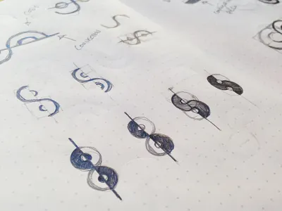
S Mark Concept

Some more refinement of the s-mark we have been working for our new product. The concept has been designed to project themes of synergy, connectivity and collaboration between all areas of the design spectrum. Key elements of the brand and what it represents.
Obviously the letter S plays a role in the name, but it was a challenge to still create something unique from this letter, as there is a lot out there already.
Finally we used a circular grid to help bring balance and consistency to the overall mark.