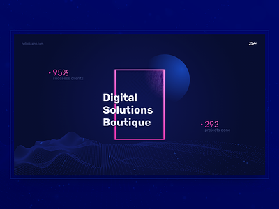
New Agency Website Redesign Contest
Hello Dribbble!
“It’s time to redesign Zajno’s website!” - they said. “It’s gotta be cool and awesome with much wow and such cool imagery” - they said. Actually, we’ve been nurturing this idea deep inside for the longest time. Now, we’ve finally decided to put it forward, and so we created a design challenge to come up with a new concept for our website.
Goals: creating an original, unconventional website that would adhere to the nature of our agency and would show our design skills at their best.
Approach: we opted for perspective scrolling. We thought it’s pretty cool because in this way we could create the illusion of space and depth that looks enchanting. You can’t really get the full picture in a static image, but trust me, it’s gonna be great! While scrolling into the deep, the terrain underneath would move together with the info that would come up from within, telling you our story, one chapter at a time.
Results: we ended up with a v.1 of the website that may and may not be just what we’re looking for. Since this is WIP, there will be updates to come. However, we’re still in search, so we’ll appreciate some feedback from you, guys.
We love hearing from you, so drop us a line!
Don’t forget to follow Zajno on social media and feel free to drop us a line:
Website | TheGrid | Twitter | Instagram | Medium

