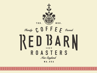
Red Barn Coffee Roasters Draft
Still movin' & groovin' on this identity.
The arc of the logotype is influenced by their current logo. The stencil through the "R" and the "B" not only distinguishes their significance but also alludes to the many sprayed marks on big, burlap bags of un-roasted coffee beans.
The mark here is inspired by Navy Diving insignias as well as Ivy League and university badges. The husband, Mark, was a Navy Diver. And the pillars of the company are Exploration. Education. Expertise.
The organic growth of the coffee plant showcases the company's dedication to authenticity - also highlighting their own, ever-expanding vision. The two horses not only represent the animals they owned on the same property as the barn, but also embody the strength and persistence of the founders. Then with two clusters of coffee beans, the two children are accounted for. This is very much a family business!
Oh wow. Long-winded. Maybe you read that all
Thanks for coming!
✿ ☺ ✿
