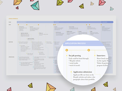
Experience Map - Shopify Internship
We don't talk about this much in the industry–"design process" can be applied to anything, even people problems.
I did a messy experience map when I was thinking through my new internship program at Shopify. I cleaned it up and tried a new layout format so some of you can see what is involved in planning out something this complex.
An experience map helps you clarify stages of a user's experience (or any person's experience) and identify areas of weakness for improvement. It's a good tool to use to "double-check" your assumptions and ensure that you're thinking about everything holistically.
There are different forms of this floating around, user journey maps, service blueprints, etc. with different categories and columns. They're "generally" the same; a way of thinking through all the touch-points.
Don't forget: it's not a one-size-fits-all. You have to adjust them depending on your project/company. This is how I mapped mine for this project.
Is this helpful?
Hit 'L' if you want to see more things like this.
Or ask me any questions about this in the comments!
Borrowed the triangle elements from @Burnt Toast Creative's illustration that he made for me for a future case study about this.


