ETTE gate update
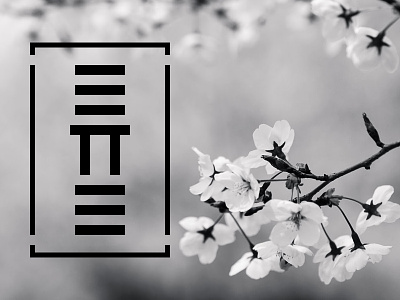
An updated version of the ETTE logo. I beveled the edges. Still minimal, but not too simple. This also gave the added benefit of the top and bottom three bars having a floating perspective, leading the eye to the gate in the center.
More by Aaron Lewis View profile
Like

