Brand work for audio visual company - WIP

Recently I got asked to help some family members out with their new audio visual services company - Almatt AV (named after the founders - Alan & Matthew).
Brand design is not my speciality but something I have always enjoyed and appreciated. I believe that brand strategy plays an equally important role as your business/product strategy.
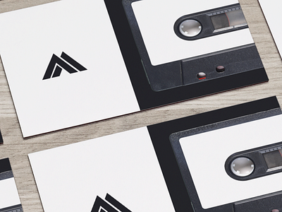
That said, my visual identity skills - especially around logos is something that is a weak point for me. So with Almatt, I worked inside of my limitations and aimed for simplicity. Early on I focused on the convenient similarities of the shape of the letters A M A V. From there I experimented with these shapes to create a minimal logo that can be used in multiple different mediums easily (stickers, cards, web, car decals, apparel etc.). The logotype is something I'm still working on.
When it came to colours, I thought about the services the company offers and the goal of their services. Their primary audience is entertainment venues, where music and visuals are all used to create positive atmospheres. With that in mind, I focused on using vibrant and contrasting colours. Landing on a highly saturated blue and then black for contrast. (see website hero preview).
One challenge with the chosen colour palette is print. Especially around good ole' paper. CMYK colour profiles lead to duller printed colours, that's where the black comes into importance :)
That's the progress so far; I'll post more as the brand and other items evolve. It has been an enjoyable side project and working on a company outside of the bubble of apps has been refreshing.