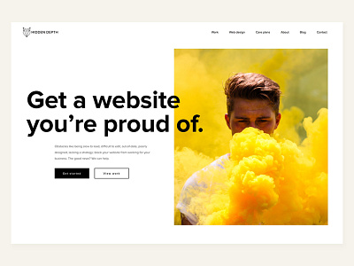
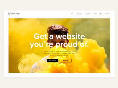
A Website To Be Proud Of
Hey everyone,
Another hero unit exploration. This version has the headline bleeding into the image. The face in the photo is in line with the headline to build synergy between the 2 sections.
Keeping the font size right is more difficult here and we will use CSS vmin to base font size on the minimum size of browser screen width or height.
Hope you like it!
More by Hidden Depth View profile
Like


