Medicspot Redesign
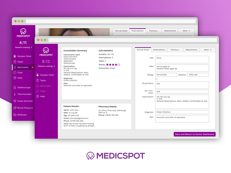
Fast-growing telemedicine startup MedicSpot required a complete redesign of the interface used by their doctors during video calls.
Working as part of a team of four, I undertook a two-week sprint utilising the entire UX process, including interviews with GPs, three Design Studios and a tonne of user testing. With a focus on increased engagement, automation and convenience, we built an interface that gave doctors access to all consultation notes without clicking outside the app, allowing them to concentrate on the thing that matters most: the patient.
The redesigns received extremely strong feedback from the startup, and they are currently in the process of implemented the design with their developers.
Check out the full case study at: https://medium.com/@jamchiller/redesigning-medicspot-a-case-study-59310295bdf4
