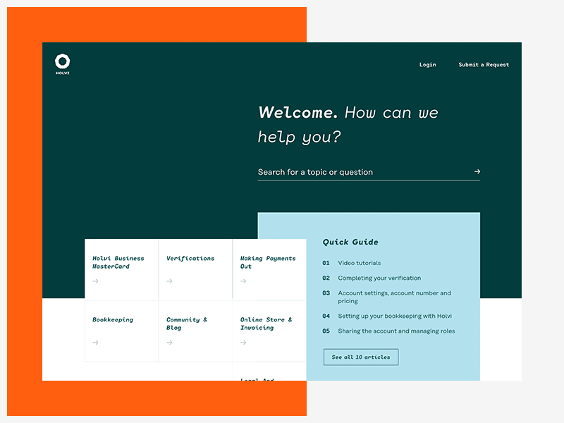
Help Centre
Decided to re-upload the shot as a .gif
Holvi, a Finland based FinTech startup, provides everything from banking to paperless bookkeeping and invoicing in one simple service.
Holvi’s new visual identity builds on simple, geometrical shapes along with a bright and vibrant colour palette. When approaching the Help Centre we saw the opportunity to challenge the average bland experience by making the process of finding the right answer a little more joyful through injecting parts of the new visual language into the designs.
Usability testings were conducted to ensure the design doesn’t creates a barrier but rather guides the user through her journey.
Shoutout to all @MAD boys who provided insightful critique and helped shape the design!
----
💌 Interested in working with me? Get in touch!


