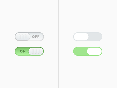
Toggle Depth Comparison
More experimentation : a toggle comparison showing how much depth and character used to go into something as simple as a radio form element.
I used this as a reference in a new article I posted about how UI and app design has been slowly losing it's personality.
Check it out here: The Death of Personality: The Flat Design System
More by tdarb View profile
Like
