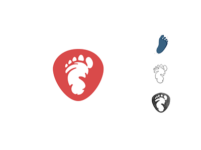
Free Yeti logomark redesign process
The first big step in the process of redesigning the visual identity for Free Yeti, a small company that it’s all about freedom and passion for winter sports, about experience and about friendship.
The footprint solution found in the initial logo was the road we took also, as we did not want to move too far away from the audience perception. We added a new layer though, alongside the adventurous one – a protective shield shape to stand as a promise of the quality of the products the brand sells, even if they are refurbished, thus letting the client enjoy the ride, but keeping them safe at the same time.
Have a great day guys. Go to our Behance for the full case study.
More by Florin Capota View profile
Like
