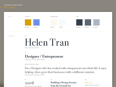
V9.0 Style Guide
I used to do this when I was working on larger system design projects in-agency. It's to ensure I'm not introducing snowflake-y elements without reason. When you're working across 30+ templates, it's difficult to keep everything in your mind (and probably not a good idea to assume you can, either).
As my website's content balloons, I have to be more careful with how I 'use' every element. Now that I'm mostly done the development, I'm beginning to realize just how big my website actually is.
These are the styles I was working with for my re-design. I introduced a third typeface into my stack which is more suitable for larger headlines and some texture in background decorative elements.
A lot of things have been inherited from my current existing styles... like the colour palette. It's "mine" so-to-speak. ;) I've been using it for years and can't seem to move off it.
Check out the attachments for a closer look for desktop and mobile.


