Struggling with navigation 🤔
⚠️ Need your feedback
Lately I've been working on an application about e-learning.
I'm struggling on the app navigation.
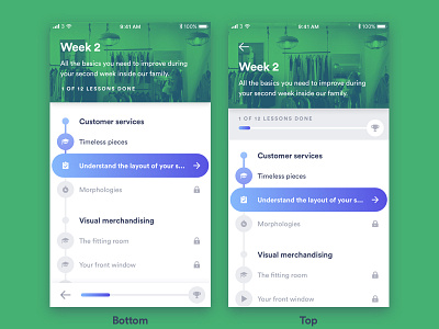
Here are 2 versions :
• one with the back button and the progress detail on the bottom (to use easily with one hand)
• one with the back button in the header and the progress bar between the header and the lessons list (more common)
Which one do you prefer and why?
Please find the real sized screens here → https://www.dropbox.com/sh/5gd19e6gh2fln86/AAAoKcSMPBq9aofg-ssfm9C5a?dl=0
Thank you all in advance 🙌
You rock guys 🚀
More by Luc Chaffard View profile
Like
